
Every day,
recognisably
ours:The brand,
in practice:
The colours, type, details and words that make Last active feel like Last active.

Paper, ink, Geist, connected bands.
Simple ingredients. A distinct system.
A clear daily ritual:
A recognisable visual system for the things you use, the routine you follow, and the last time you did it.
Lose the guesswork.
Suggested brand line. A new messaging recommendation, not an existing approved tagline.
What Last active does
A personal skincare routine companion that brings your shelf, schedule, and activity into one place. The design makes everyday actions visible and easy to return to.
Positioning · recommended
For people managing several skincare products, Last active is the personal routine companion that makes the shelf, schedule and activity record visible together.
Who it is for
People juggling products and routines who want a clearer record of what they used and when. This is a working audience definition inferred from the app, not completed market research.
Our character
Clear. Tactile. Considered.
Personal. Quietly playful.
Heavy type brings clarity. Paper brings calm. Colour makes each collection feel personal. Interaction should feel direct and deliberate.
Make the next action obvious. Keep one strong heading and a useful hierarchy.
A product keeps its band identity within a session. The routine feels familiar.
Describe what happened. Avoid judging a person by a missed routine or their skin.
State what is known, what is suggested, and what still needs checking.
Mission · recommended
Help people keep a clear, usable record of their skincare and return to a routine that makes sense to them.
Vision · recommended
Make everyday care easier to understand, remember, and maintain.
An identity with a signature:
Use the supplied artwork. The wordmark, colon and double ticks each have a distinct job.
Double ticks plus colon. Use for brand recognition and the native Today navigation icon.

Original tick paths, colon removed. This is the selected Today state, not a replacement master logo.

Use the supplied raster asset. Let the platform apply its app-icon mask.
Give it room
Recommended clear space: at least one visible wordmark letter-height on all sides. For the symbol, use one tick-height. Keep text, rules, and colour boundaries outside this space.
Recommended minima: wordmark 120 px wide digitally / 30 mm in print; symbol 24 px / 7 mm. Test at final size. Native artwork already used smaller in a component retains that component’s specification.
Two wordmark files, one drawing
Tight crops the original artboard for layout. Original preserves its supplied canvas. Both retain the same vector paths. Do not stretch the canvas or rebuild the lettering in Geist.
Default: ink on paper or a light band. A reversed treatment is a proposed extension only; no new reversed master is included.
Download tight wordmark ↗ Original canvas ↗
Keep the identity intact
- Write the name Last active, with a lowercase “a”.
- Never substitute typed text for the supplied wordmark artwork.
- Do not distort, rotate, outline, add shadows, or recolour the logo decoratively.
- Do not add the colon to selection checks or remove it from the master mark.
- Use a quiet, high-contrast background; avoid photography behind the mark.
- Do not revive historical Layerline branding in current communications.
Paper. Ink. A little colour.:
A fixed neutral foundation. One dominant colour family, a distinctly different support and a small accent. A fresh composition each new app session.
True black belongs to the timer. The Beauty Timer uses #000000. Standard brand Ink remains #191919.
A clear relationship between colours.
The dominant family supplies the main character and largest share of colour. Support must be recognisably different while fitting the composition. Tiffany green with blue is the approved example; another almost identical green tint does not provide enough distinction. Add the accent sparingly.
#7CD7D2#AEC3FF#F7B29AIllustrative Tiffany / blue / warm-peach composition, generated from the current native preview seed. These are example values, not a permanent hero palette.
Compose a family
Vary hue relationships, lightness, saturation and proportions. Make each new palette noticeably different from recent ones while keeping its colours cohesive.
Keep most surfaces Paper. Use colour in flat connected bands and the capsule, with crisp boundaries and Ink lettering.
Keep meaning clear
Avoid a full-spectrum rainbow, near-identical rerolls and smoothly ordered gradients. Do not assign permanent ingredient or product meanings to generated colours.
Words and icons carry meaning. Colour does not communicate efficacy, safety, urgency, skin type or ingredient compatibility.
Ten bands from one composition.
This reproducible example shows the current native design-preview palette. Tap a swatch to copy it. Other sessions may use different dominant, support and accent families.
Fresh on a new launch
A fresh app process chooses a new composition, checked against the previous eight palettes to reduce similar repeats. Navigation and ordinary background/foreground returns retain the current palette.
Novelty checks reduce repetition; they do not guarantee a never-repeating sequence forever. App surfaces share the same session scheme.
Stable while in use
Keep assignments steady during a session. Starting a timer saves its complete minute palette. Hiding, pausing or relaunching preserves those colours even when the rest of the app receives a new scheme.
As blocks disappear, the remaining blocks expand without changing their colour identity.
The Beauty Timer counts in colour.
Support 1–120 minutes. Generate exactly one unique RGB colour for every minute: 30 minutes means 30 different colours. Separate neighbouring blocks visibly within the selected families. Do not repeat a ten-colour sequence.
30 minute blocks · 30 unique colours. At 120 narrow columns, exact uniqueness is required; every pair is not guaranteed to look different.
Seconds use six flat blocks, each representing 10 seconds. Order their parent-colour shades from lightest at the top to darkest at the bottom. The active bottom block gradually shrinks while the remaining blocks expand, retaining their own shades. During the final 10 seconds the minute column itself contracts and the other minute columns expand; the final minute contracts over Paper. Keep crisp shared edges without outlines, shadows or dark dividers. This replaces the earlier shuffled second-tone rule; the minute palette still avoids rainbow sequences and smoothly ordered gradients.
One minute · six 10-second blocks. Lightest at top, darkest at bottom. Static example.
Completed beauty sessions use connected colour bands like other logged items. A category-only entry such as “Mask” can be removed; separately logged product uses and shelf entries remain intact.
Readability is part of the palette.
Every generated final RGB/hex colour must achieve at least 7:1 against Ink #191919. Check the exported values, not only intermediate colours. Colour never replaces a label or state indicator.
Line and the existing field border remain decorative or secondary; strengthen a boundary when it is needed to identify a control. These pair measurements do not certify the whole app’s accessibility.
Digital RGB/hex values are authoritative. No approved Pantone or CMYK equivalents are specified. For print, convert with the printer’s profile and approve a physical proof.
Geist, with conviction:
One family. Four weights. Oversized, tightly spaced headings balanced by small, useful labels.
Aa Bb Cc Dd Ee Ff Gg Hh Ii Jj Kk Ll Mm
0123456789 & / ( ) + : →
| Role | Size / weight | Tracking | Use |
|---|---|---|---|
| Page heading | 40 / 800 | −1.8 pt | Shelf:, Good morning: |
| Section heading | 15 / 700 | −0.25 pt | Label followed by a rule |
| Product name | 17 / 700 | −0.5 pt | Primary line of a band |
| Body / action | 14 / 500 or 700 | Default | Descriptions / ink buttons |
| Input | 16 / 500 | Default | Text-entry fields |
| Band metadata | 11 / 500 | Default | Brand and supporting line |
| Capsule label | 9 / 800 | +0.5 pt | Selected uppercase tab |
Editorial rules
Use sentence case and short headings. A colon finishes the main app heading; it is a visual signature, not punctuation to add after every sentence. Reserve uppercase for small labels and selected navigation.
Do not tighten paragraph tracking. Aim for 45–75 characters per line. Avoid artificial bold or italic when the corresponding font file is absent.
Beyond the app · recommended
Web body: 16–18 px with 1.5–1.65 line height. Display: 48–88 px on wide screens, 36–52 px on phones. Keep very large headlines at roughly 1.0–1.05 line height.
Load the bundled Geist files. If unavailable, use system-ui, -apple-system, BlinkMacSystemFont, sans-serif. This is a fallback, not a second identity font. Respect text scaling and avoid clipping.
Geist is bundled under SIL Open Font License 1.1. Retain the licence when redistributing the files.
Connected by design:
Flat paper, decisive type, edge-to-edge colour within a shared inset. Separation comes from structure and space.
Native horizontal content inset.
Product band internal padding.
Gap between connected product bands.
Quiet section rules, used decoratively.
Capsule height; 16 pt side inset, 412 pt maximum width.
Use
Aligned left edges, continuous colour stacks, crisp rectangular actions, generous section spacing, and a single clear content hierarchy. Preserve the Routine carousel and the capsule as distinct forms.
Avoid
Floating cards around every item, equal corner rounding everywhere, decorative drop shadows, generic grouped settings lists, or a system tab bar that erases the custom capsule.
Native points are platform measurements. This responsive guide adapts the rhythm for the web rather than copying every native size into CSS.
The parts people recognise:
These details carry the identity from one screen to the next.
Ink rectangles
Paper lettering, Geist Bold 14 pt, 16 pt vertical padding. Compact actions add 16 pt horizontal padding. Keep edges square. A pressed button uses 85% opacity; disabled is 40% in current native code.
Use verbs that name the action. Preserve a clear confirmation for destructive actions; colour alone is insufficient.
The original double ticks
Selected Today bands use the colon-free checks. Keep a programmatic selected state and a text label. Do not substitute a checkmark character or an unrelated icon family.
A capsule you can glide across
Five destinations: Routine, Shelf, Today, Calendar, Profile. The active segment expands to 2.4 shares while others take one. Its label replaces the icon. Use the original mark, including its colon, for the inactive Today icon.
Original icon family





Reuse the bundled Ionicons assets. Match the actual role and filled/outline state; do not indiscriminately convert everything to a new line style. Native general icons default to 18 pt.
Shelf deletion
Swipe reveals an Ink Delete action. The band stays opaque and moves past the content inset to the screen edge. Keep the confirmation and cancellation path. Never fade the entire band or make it bounce backwards on release.
Quietly alive:
Movement clarifies a change of state. It should never become the work the user has to wait through.
Web interpretation of the native colon reveal. Timing matches the source; rendering and touch feel are platform-specific.
| Moment | Duration | Rule |
|---|---|---|
| Heading reveal | 380 ms · ease out | Words stay still; the colon uncovers them moving right. |
| Capsule selection | 220 ms · ease out | Colour and width move together. |
| Shelf settle | 180 ms · ease out | A single direct release with an independent row offset. |
| Shelf, reduced motion | 100 ms | Shortened native settle. |
Make feedback meaningful
The native design uses a heavy impact for selection and carousel landings. Use feedback on a committed state change, not decorative loops. Preserve the existing Routine carousel mechanics instead of approximating them with unrelated animations.
Respect reduced motion
Native headings reveal immediately and capsule animation is removed when Reduce Motion is enabled. This guide also removes animated reveals and transitions under the web preference. No parallax or automatic continuous movement.
Useful, without the noise:
Speak with the same clarity as the interface: direct, human, measured, and free of pressure.
“Your shelf is empty. Add your first product.”
“Unlock your ultimate skincare journey!”
“Nothing logged today.”
“You broke your streak.”
“Review the schedule before saving.”
“Your perfect routine is ready.”
“We couldn’t verify this ingredient list.”
“This product is definitely safe.”
“Couldn’t save. Try again.”
“Oopsie! Something went wrong.”
Writing rules
- Lead with the action or the useful fact.
- Use short sentences and natural contractions.
- Use sentence case; keep “Last active” exactly.
- Use numerals for counts, dates, and durations.
- Reserve exclamation marks for rare, fitting moments.
- Label suggestions as suggestions and uncertainty as uncertainty.
Vocabulary
Use: shelf, routine, today, last used, log, add, edit, review, save, suggested, source, not yet verified.
Avoid: flawless, perfect skin, miracle, holy grail, guaranteed, anti-ageing promise, toxic, chemical-free, cure, clinically proven without evidence, guilt, streak failure.
New voice and messaging recommendations. The descriptive product claims reflect observed app structure. No clinical benefit, diagnostic accuracy, public availability, or treatment outcome is implied.
One system, many surfaces:
Extend the app’s visual logic. Keep the same ingredients; adjust the composition for the medium.
Your routine,
in view.
Social & launch
One large idea per composition. Use a paper field, the supplied wordmark, and one connected colour stack. Keep artwork within a generous safe margin; preview platform crops. Use real, current app screens and identify sample data.
Website & email
Wordmark first, one clear headline, one Ink primary action. Use colour to organise content. Email layouts should remain readable with images blocked; use live text for the message and supply logo alt text.
Imagery
Prioritise actual interface and product details. If photography is needed, use honest texture, soft light, uncluttered backgrounds and inclusive subjects. Avoid skin retouching that implies an outcome, generic spa imagery, or unsupported before/after comparisons.
Presentations & documents
Paper background, Ink heading, generous margin, a thin rule, and a small wordmark. Give each slide one point. Recommended slide text: 32–48 pt heading, 20–24 pt body; test at presentation distance.
Print & stationery
Use uncoated, neutral-white stock after proofing. Business cards and letterhead use the wordmark and a simple left-aligned contact block. No unverified address or contact details are supplied. Use approved printer profiles, not invented Pantone matches.
App references · swipe to explore →
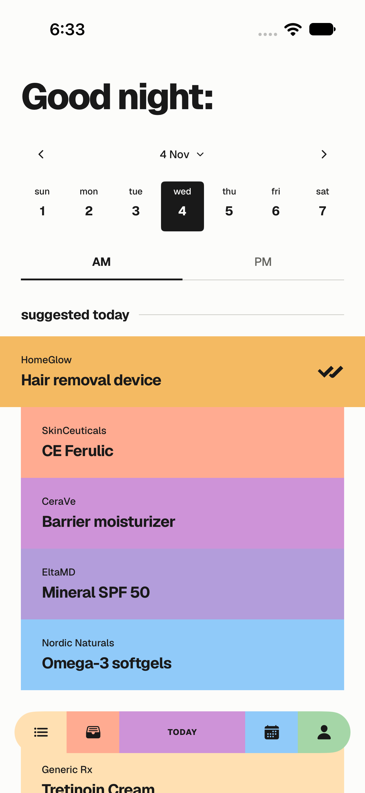
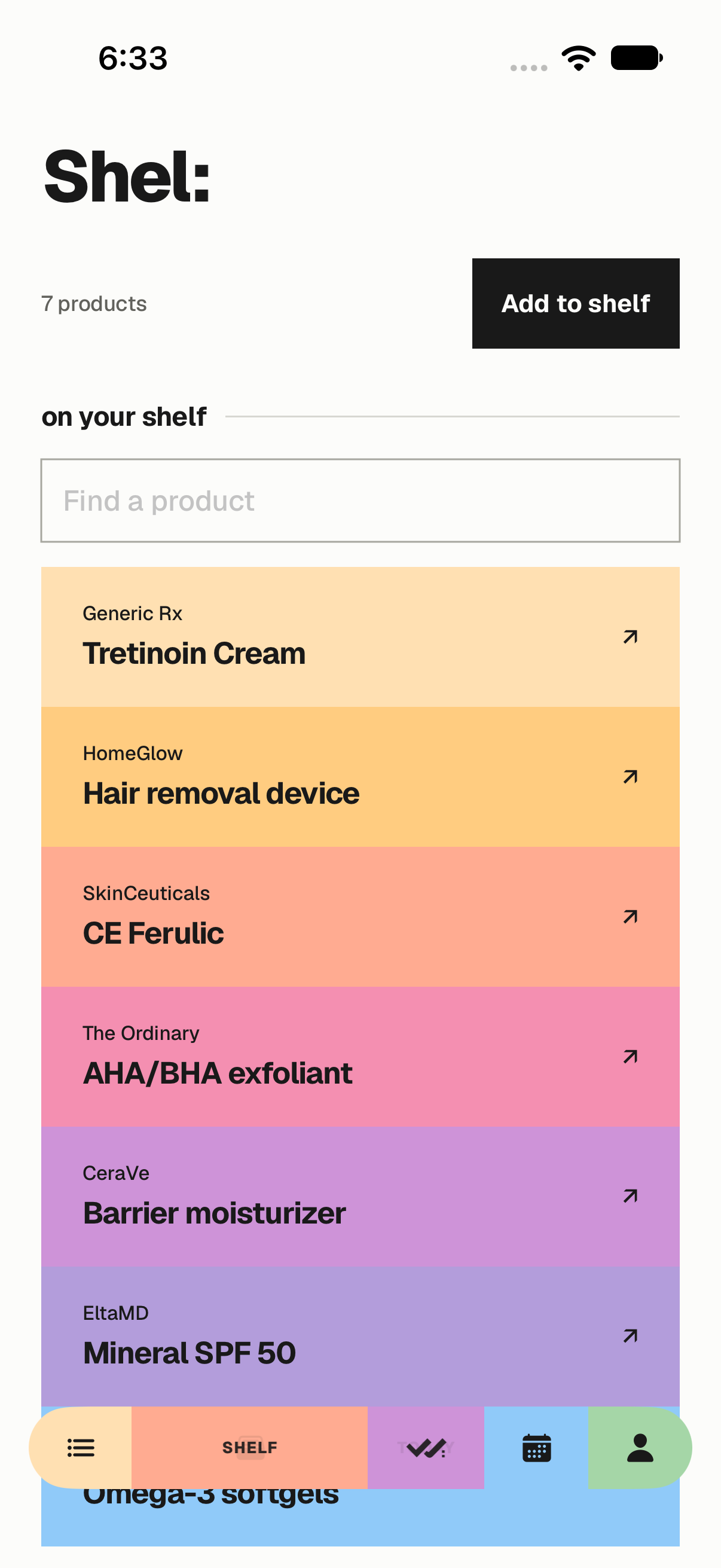
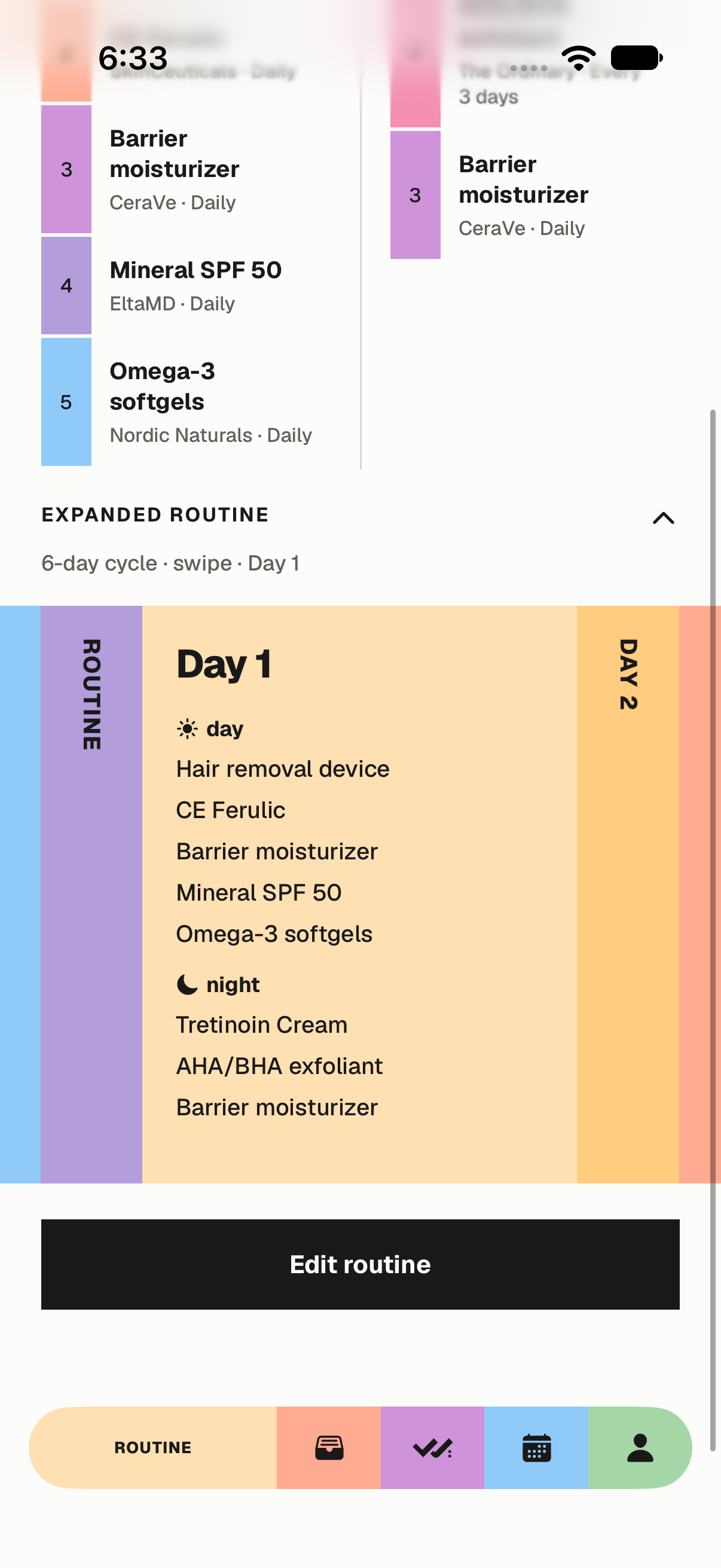
Retained simulator captures from the approved November 4 review, using sample data. They are historical layout references; their old palettes are superseded by the current colour rules. They are not newly captured screens, clinical advice, or evidence of public-launch readiness.
Ready to use:
Original artwork, licensed fonts, implementation tokens, and a compact record of where the rules came from.
Take the system with you.
SVG logos, app icon, four Geist weights, icons, reference screens, CSS and JSON tokens, and source receipts.
Owner
Oliver owns brand decisions. Use the established app rules now; treat new messaging, clear-space and cross-channel recommendations as proposals until adopted.
Before releasing anything
Check exact artwork, name casing, colour contrast, mobile cropping, font loading, and claim accuracy. Confirm that screenshots match the product being released. Retain font and icon licences when sharing assets.
Built from the product:
A practical record of what is established, what is recommended, and what remains unverified.
Established
Last active name and supplied artwork; Geist; Paper/Ink neutrals; generated session palettes; connected product bands; custom capsule; Routine carousel; November 4 Add, Delete, Edit and selection revisions; November 13 dominant/support/accent palettes and the installed Beauty Timer.
Recommended here
Mission and positioning, brand personality, voice, suggested copy, logo clear space and minimum sizes, web type scale, photography direction, and social/print applications.
Not established
A public launch, clinical efficacy, exhaustive accessibility compliance, an approved Pantone/CMYK specification, dark-mode identity, or App Store availability.
Source record
The original guide was checked against native source on November 12, 2026. Colour rules were updated on November 13 against Oliver’s approved distinct-support direction and the installed implementation. CohesivePalette.swift and docs/cohesive-colours.md define current generation and timer continuity. PaperDesign.swift supplies colours, fonts, spacing, navigation and header timing. SkincareTrackerApp.swift supplies bands, Shelf and action behaviour. PaperToday.swift, PaperRoutine.swift and the launch assets supply supporting identity. The project’s November 4 standing decision records approval of the promoted design.
The screenshots are retained November 4 sample-data captures. Asset files are copied unchanged; original source-file hashes are retained in the initial source receipt, with the current colour source receipt alongside it. This guide does not change the app or its backend.